Penna
People Change Performance

A leading European player in human capital management, this ambitious HR company was starting to appear a little fragmented through a combination of acquisitions and remote locations. It wanted to unify the various trading entities within the holding group under one distinctive brand umbrella.
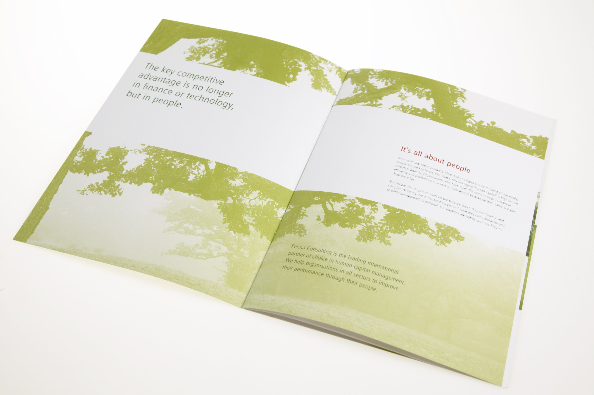
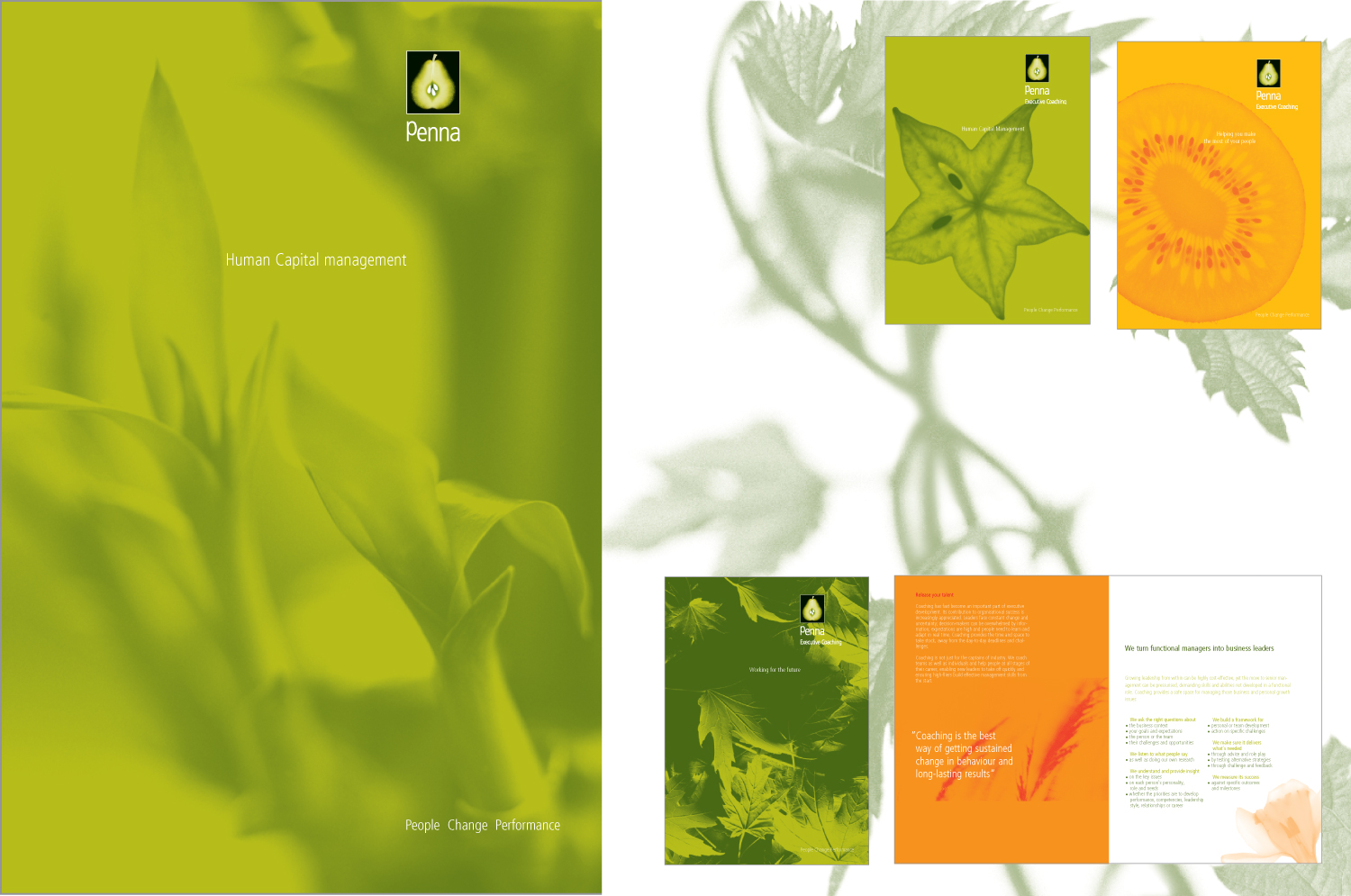
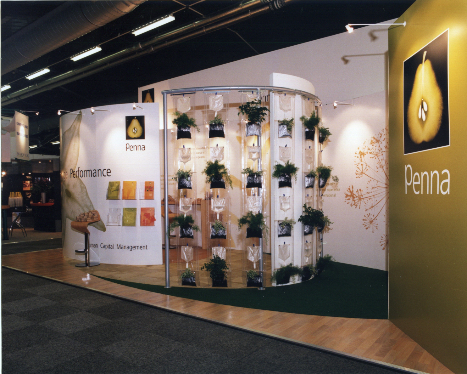
Whilst working for Tank Europe, Louise and a team of designers defined a new brand language for Penna. Focusing on the theme of personal and organisational growth, the symbolic meaning of the ‘pear’ was used to differentiate Penna from other HR businesses.
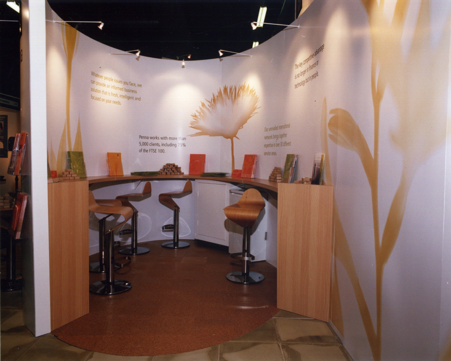
The fresh new look was built on an existing logo and colour palette, with Louise and the team creating a new image library and design guidelines. This ultimately connected the brand to all of Penna’s marketing groups and partners and united the company in a distinctive and cohesive manner.


Services:
- Brand Creation
- Creative Direction
- Graphic Design
- Brochure Design
- Exhibition Design
