Active communications
Connecting continents

Active prides itself in making things happen. A marketing and PR consultancy helping British and Chinese companies connect, the business needed a rebrand to reflect the spirit and vitality it was keen to exude.
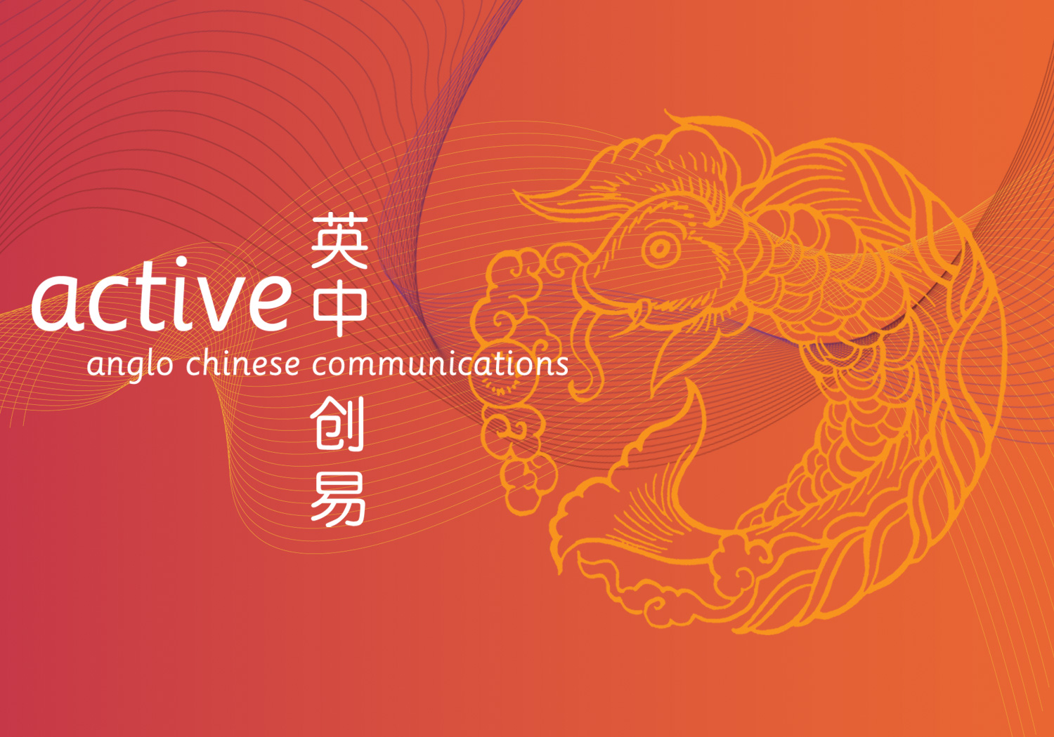
I was commissioned to refresh Active’s identity and part of the project was to design a logo featuring both English and Chinese characters. I integrated the use of red and black colours to reflect Active’s rich Chinese heritage and introduced graphic illustrations into the designs for the stationary portfolio and website. The illustrations have symbolic Chinese meanings, representing ‘good luck’ and ‘good fortune’ and were further underpinned with undulating graphic lines of communication.

Active’s strength lies in their in-depth understanding of two very different cultures and the bold, vibrant branding falls in line with its business strategy and successfully appeals to both nations.

Services:
- Rebranding
- Creative Direction
- Graphic Design
- Logo Design
- Illustration
- Web Design
